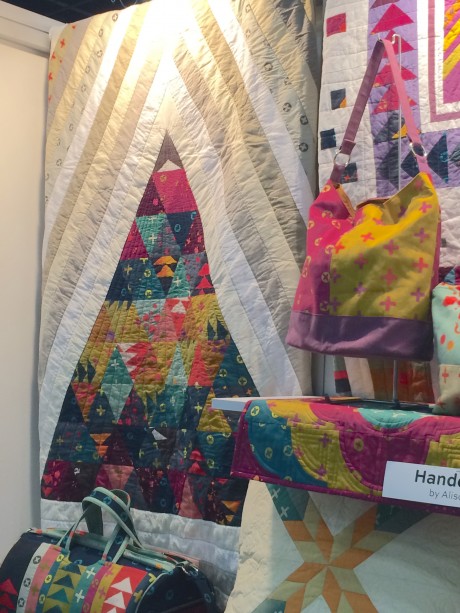
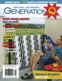
Sometimes while we’re strolling the aisles of Quilt Market, a quilt captures our attention that we.just.must.have. And it’s even sweeter when we can leave Quilt Market with said quilt. Walking by the Andover booth at Fall Market 2014, this quilt said, “take me home, c’mon I double dog dare ya!” Up, designed and made by Giuseppe Ribaudo is that quilt.
Here it is pictured in the Andover Fabrics booth among other quilts, totes and bags made with Alison Glass’ Handcrafted line. (Sorry, Q-bies, we have the pattern for Up in our March-April issue, but not all the rest of this gorgeousness).
Because we’re a bit nosy, we asked Guiseppe to tell us a little bit about his design process. Here’s what he shared:
Up
The prints in Alison Glass’ work are so much more than just pretty shapes. I always see a story in her work. It’s what makes working with her textiles so wonderful. The fabric that went into this project was no exception. The quilt design was directly inspired by the fabric itself.
I was struck by the primitive nature of Alison’s Handcrafted line. While the line is incredibly sophisticated, the shapes used within it felt primeval to me. The way the actual fabric was created also lent to my thoughts of it having an “early” sort of feel to it.
To me, the line seems to be about discovering shape and form. It made sense to me that my quilt would communicate similar themes. So I started thinking about what shapes someone in the pre‐historic era would draw. I thought about their art and the simple forms strewn across their cave walls. My research always seemed to bring me back to the triangle. It’s a shape used in art that dates back as far as art itself. It’s also a shape that we use today in virtually all of our quilt patterns in one form or another.I wanted to make this quilt as a sort of homage to this beautiful and diverse shape.
When deciding on a layout, I knew I wanted the triangle to feel like it was moving. Originally, the design was just a triangle made up of other triangles. But that felt a bit stagnant to me. I decided to add stripes moving upwards and outwards to give the shape a kind of radiance. I knew I wanted the focus to remain on Alison’s line. I decided to keep the stripes in Andover’s chambrays and textured solids in muted, low value shades. The combination of quilting cotton, chambray and textured solids give the quilt some depth and dimension, as well as texture. To keep movement within the triangle itself, I used a subtle spectrum. The triangle fades from purples and blues to red and orange and back to the cooler tones.

When quilting the piece, I again wanted to emulate the idea of upward mobility. The quilting within the triangle moves up, shining down from the top-most point. The stripes around the outside of the triangle also move up a simple quarter inch straight line around each of the seams. I am so grateful to have had the chance to work on this quilt. It sparked in me a curiosity for a more contemporary approach to quilting. Lately I have been experimenting much more with negative space and bold pops of prints and colors. This quilt is most certainly responsible for my new awakening.–Giuseppe Ribaudo
See more of Giuseppe’s work on his Instagram feed, @giucy_giuce. And we hear that starting this evening (April 16 eastern time) there’s a giveaway of a tower of fat quarters of Alison Glass’s Ex Libris, plus a copy of our March-April issue featuring his quilt.
Check it out!
Quilt. Sew. Live. Breathe.
COMMENT #1
Fantastic feature!
COMMENT #2
Very cool quilt. (But please people! Low CONTRAST, not low volume!)